Phaion
Creative agency.
Project
Branding / motion graphics / creative direction / art direction / Web design / UX & UI
Client
Phaion Ltd
The mission
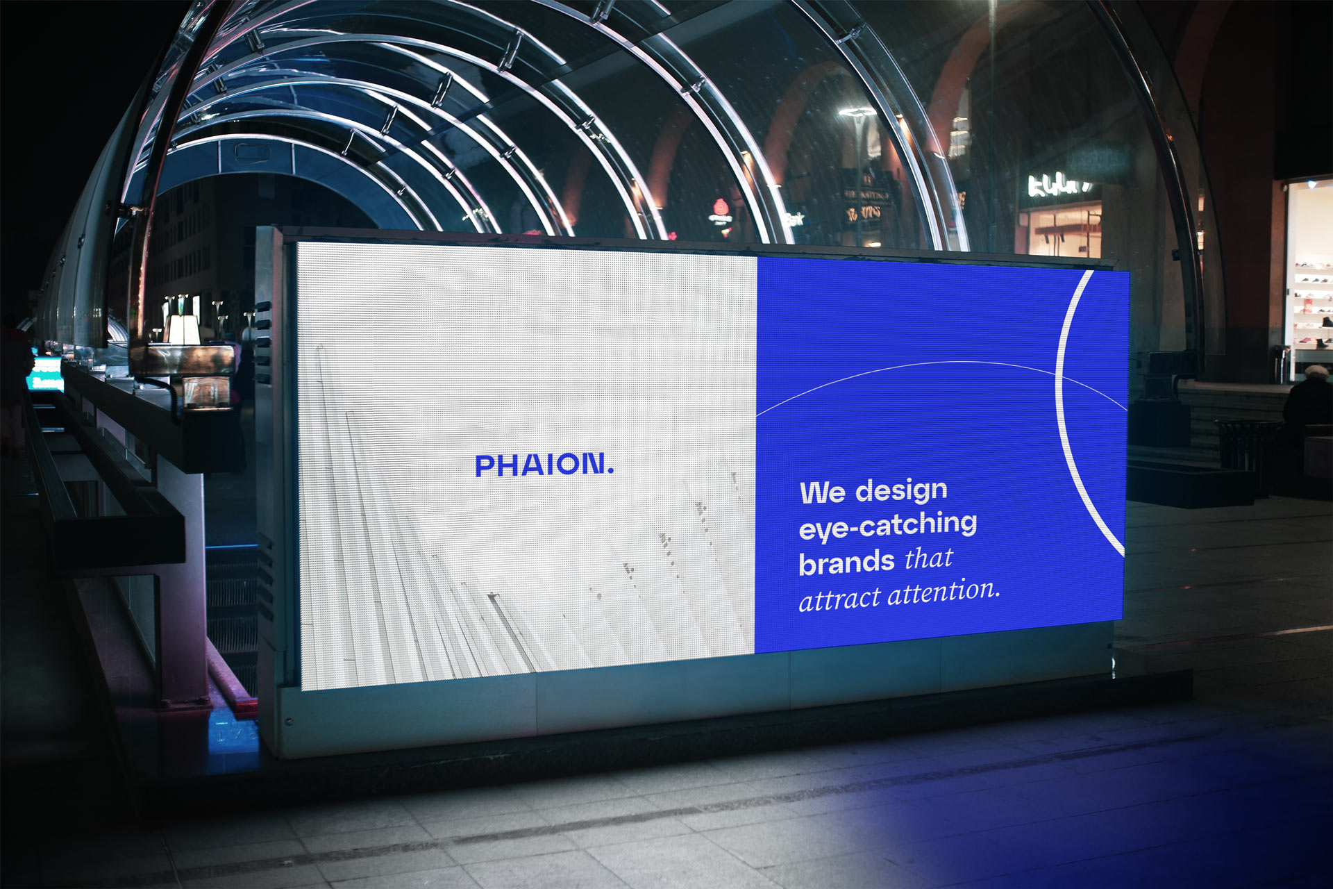
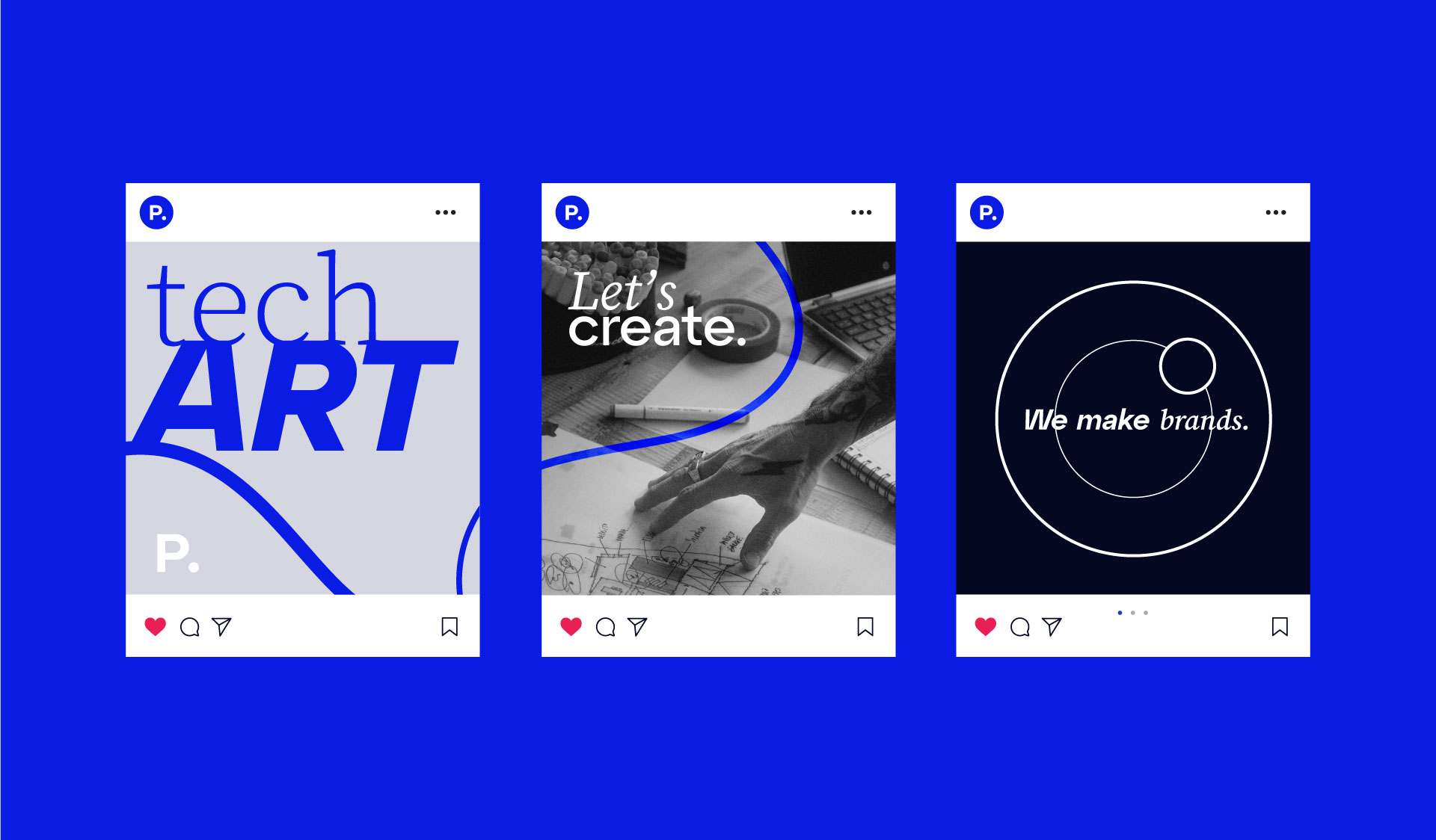
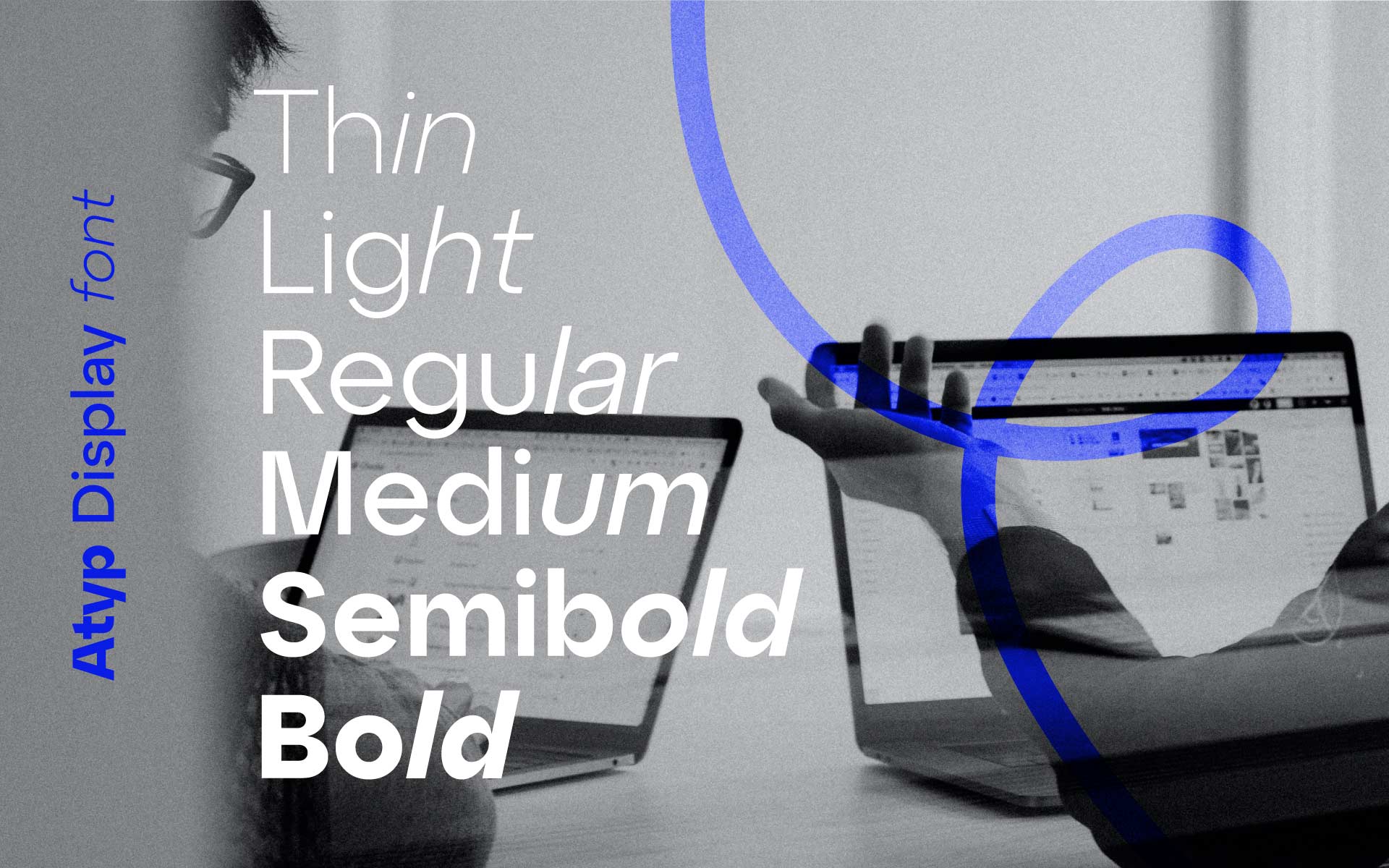
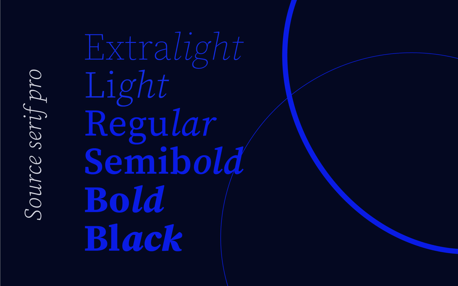
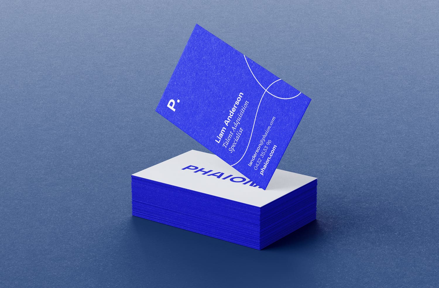
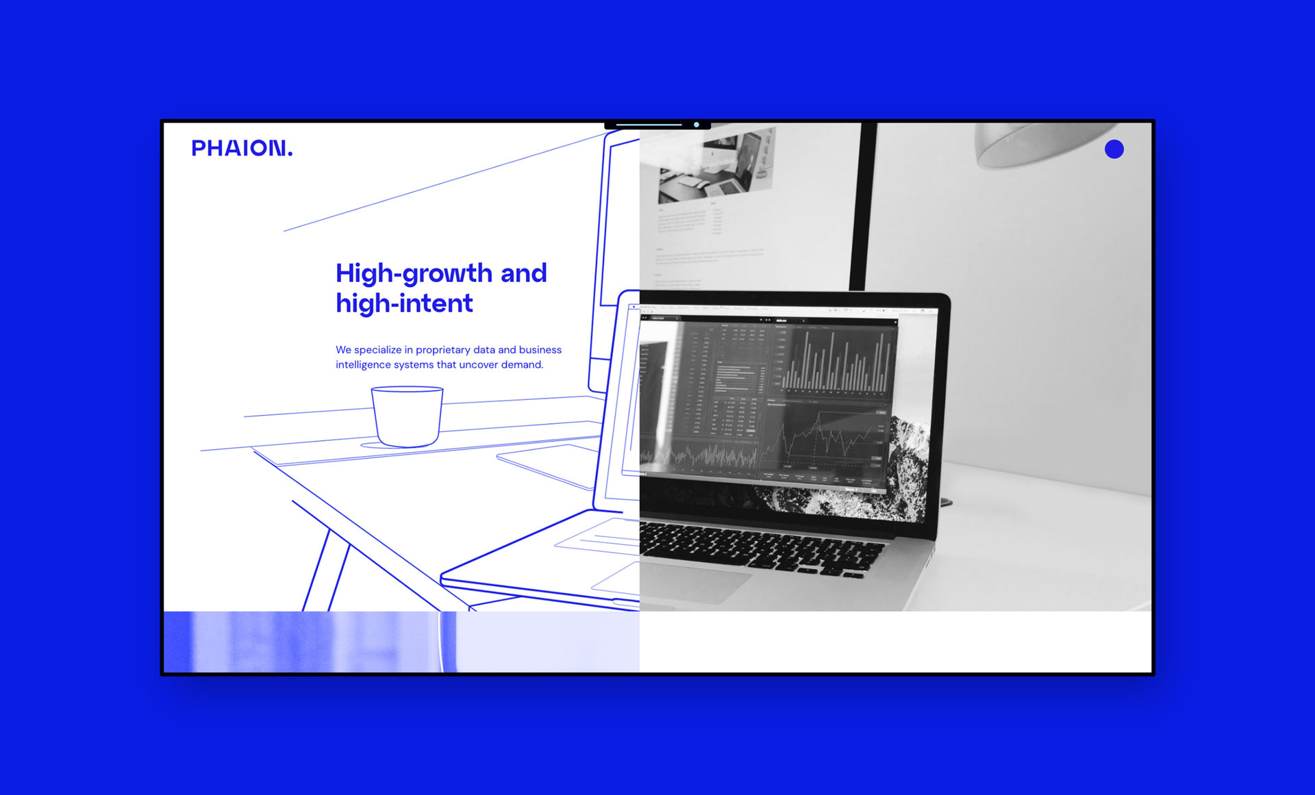
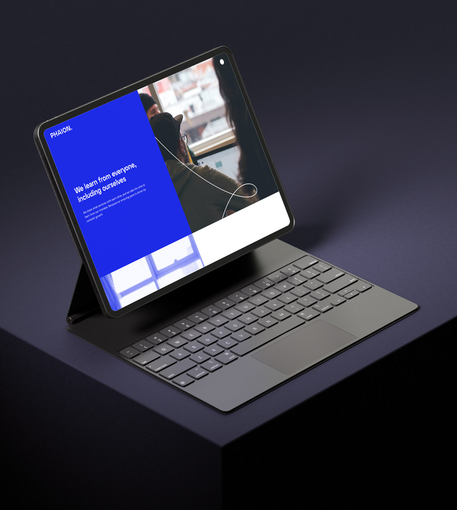
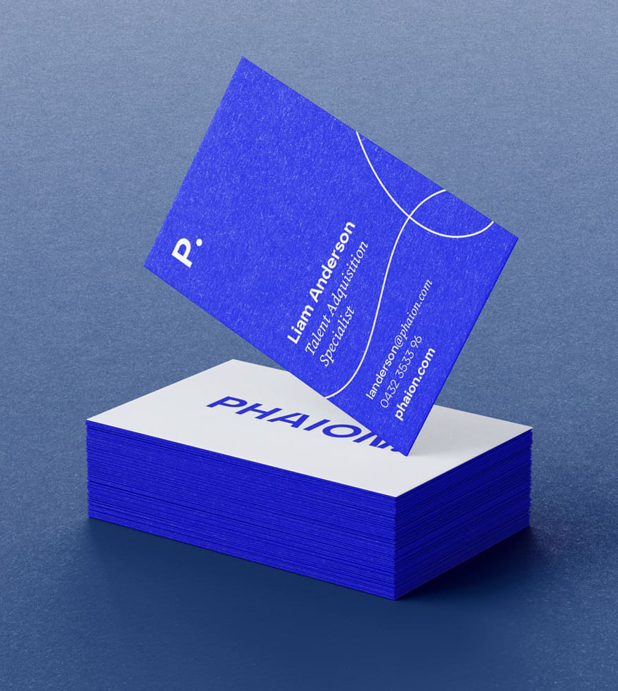
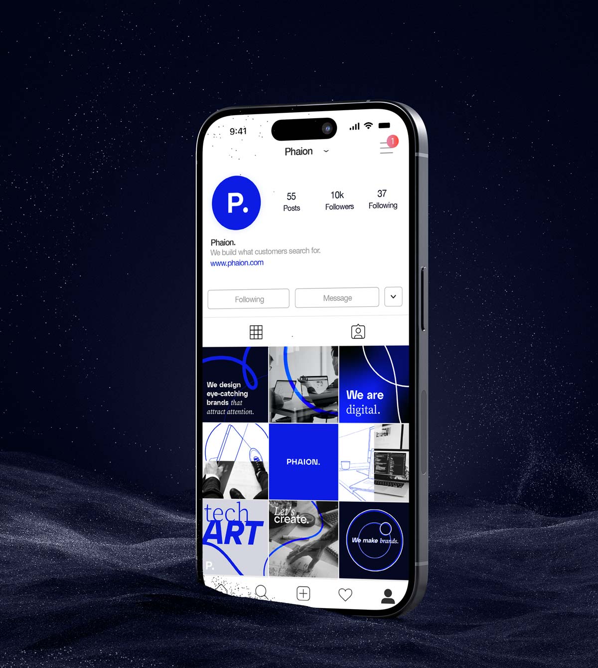
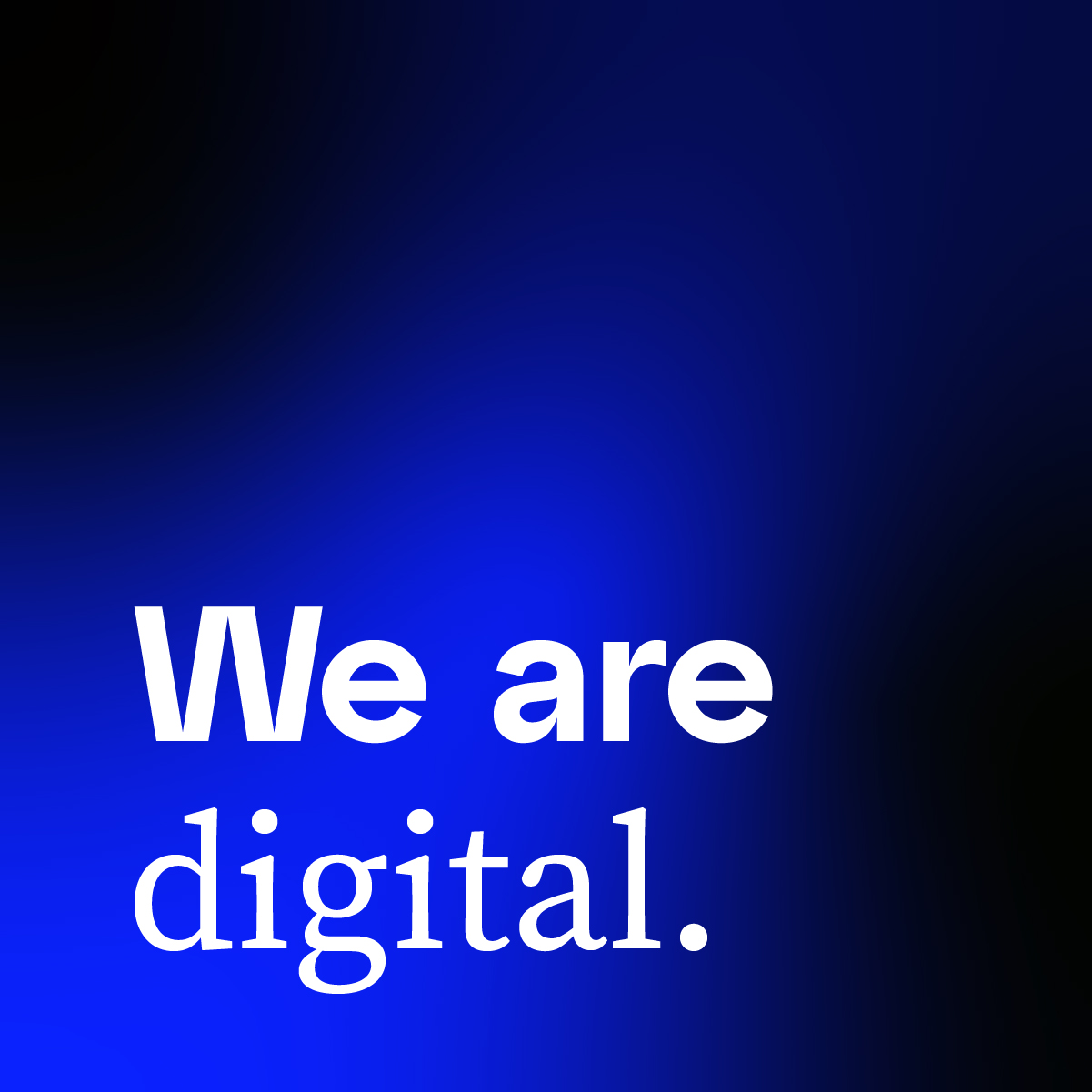
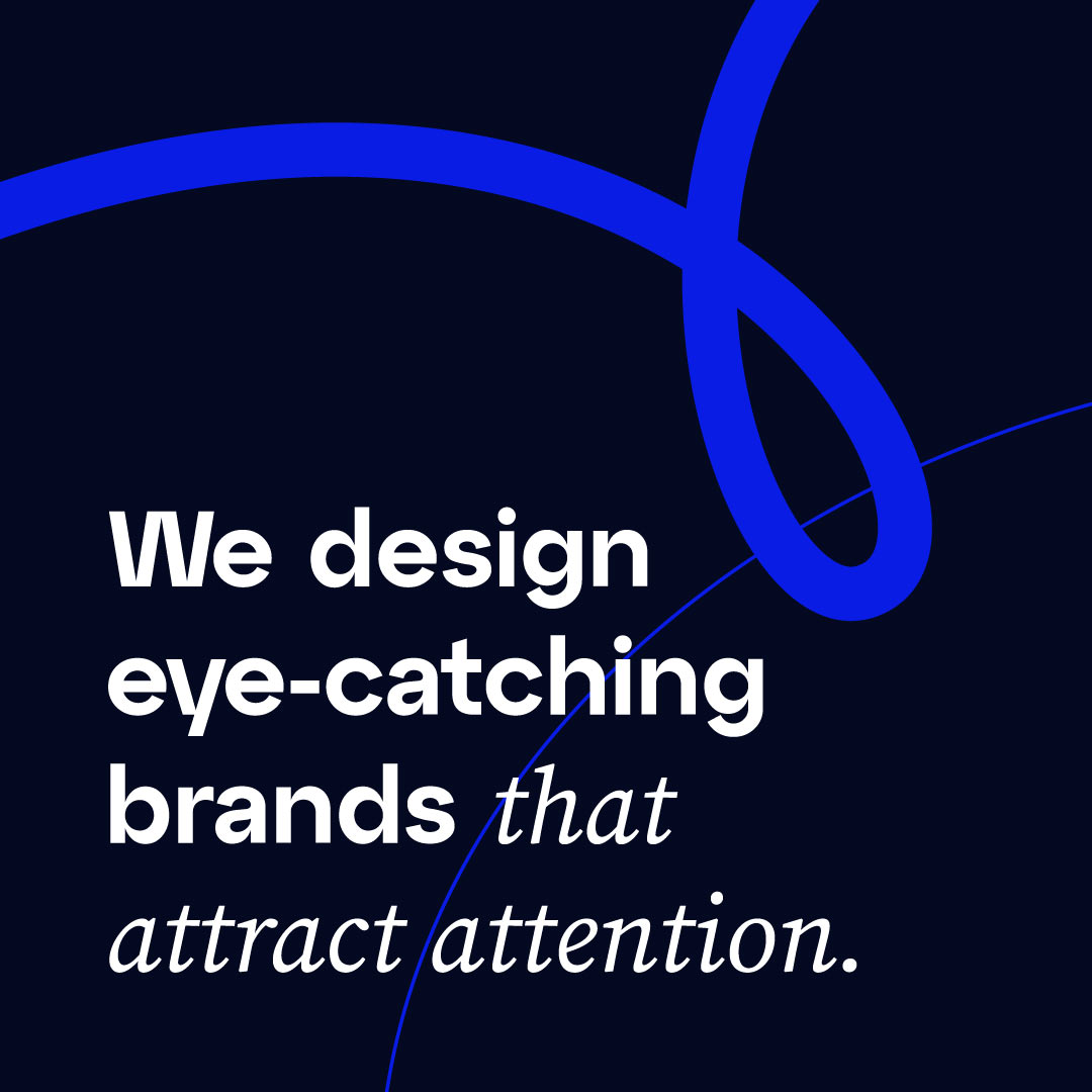
From the brand identity through to web design, UX/UI, art direction, icons and social media content, I needed to create something that felt different to what is known to the agencies/tech brands, creating an ownable identity that breaks the mould, using two really different font, a modern, techy and different main typography with so much character and style…mixed with an elegant font that create an interesting contrast and unique look and feeling when you place them both together.
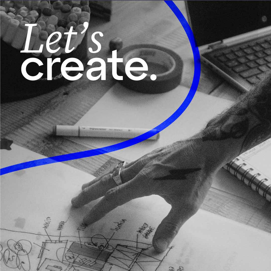
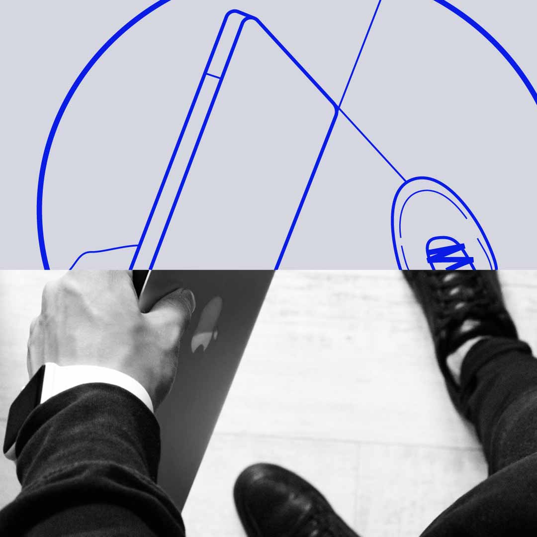
Apart from that, the use of straight/geometric shapes representing the digital part of the company, connected with curved/organic shapes representing the human and creative part of the agency.
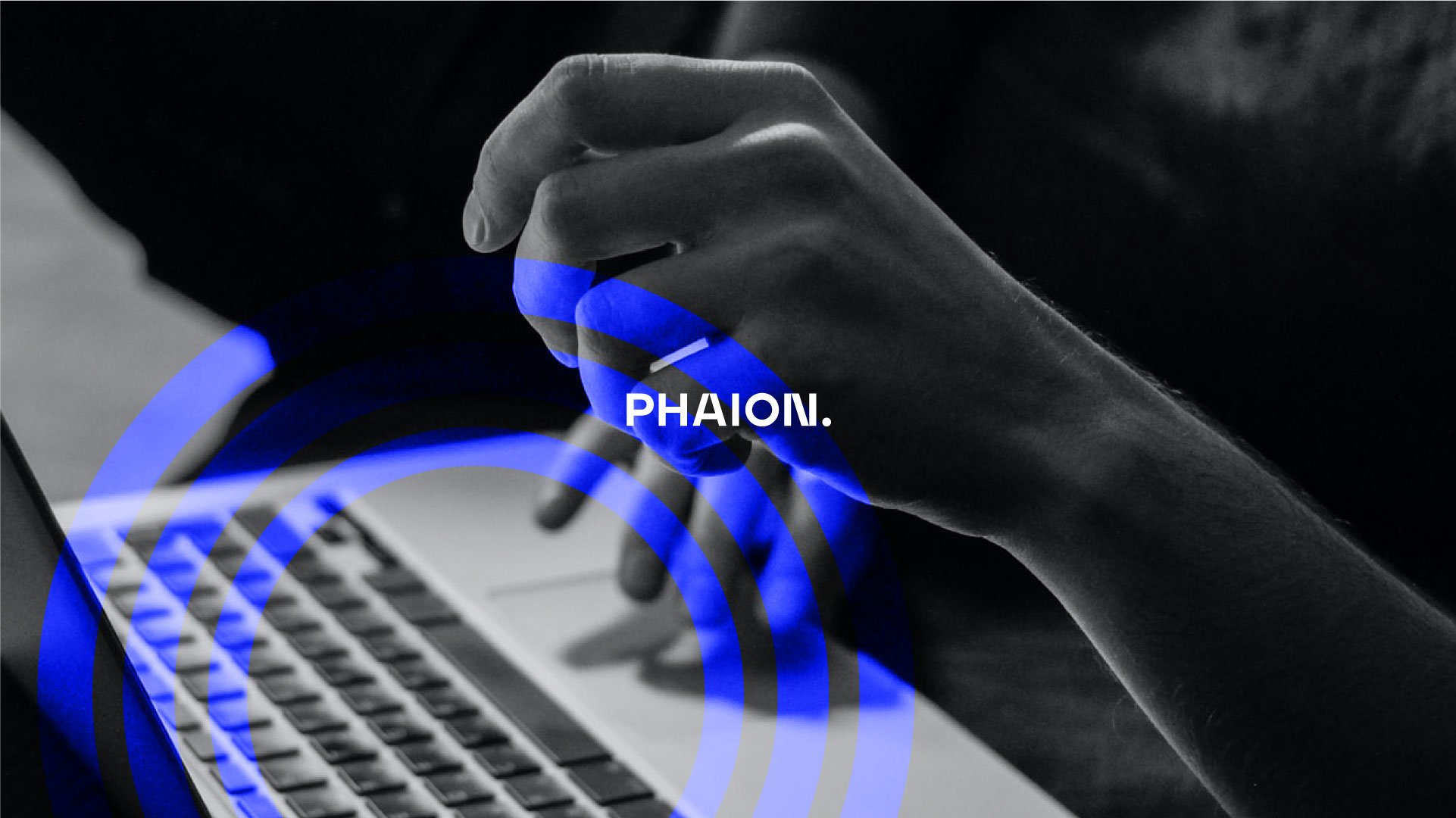
The used of uppercase for the logo to stand out, it’s made by modern, powerful and timeless typography has some modifications within the letters to make it unique and the dot at the end to express confidence.


